On Nov 9th, 2020 Pfizer issued a press release stating their conclusion that the COVID-19 vaccine they developed with BioNTech appeared to be 90% effective. While their test contained over 43,000 volunteers they had only detected 94 cases of COVID-19. How confident can you be with only 94 cases? I decided to explore this matter for myself.
I am but a lowly crystallographer, and I’m sure a proper mathematician could do a more rigorous job, but I’ll do the best I can.
The Experimental Design
I was not familiar with the design of this clinical trial but it seems rather straight-forward. You take a whole lot of people and split them into two groups, keeping their group assignment secret from everyone who will be involved in their handling until the end of the trial. The members of one group are given the treatment which we hope is a vaccine while the others are given a sham treatment which is indistinguishable from the “vaccine” by both the participants and their doctors. You then wait to see if anybody comes down with COVID-19.
How long do you wait? You want to wait until you have enough cases to reliably answer the question you hope the study will answer but, to avoid bias, the end point has to be set before the start. If you constantly watch the results and decide to stop when the numbers look good, you could claim success when there is none. After all, life is filled with statistical fluctuations and the results might get worst with longer time.
The press release says that the design of this test says to end after 164 cases of COVID-19 arose among the volunteers but they would peek at the results after 32, 62, and 94 cases. For unspecified reasons they skipped the peek at 32 and, it appears, that the case count shot up to the 94 case trigger while they were discussing the merit of the 62 threshold. I guess this is the only benefit to the world of the huge surge in COVID-19 cases this fall.
It was the 94 case checkpoint that led them to conclude that it was likely that their vaccine candidate was 90% effective at preventing the disease.
But how likely?
To judge the reliability of the 90% number I’ll need to do some statistics. That “proper mathematician” I mentioned earlier would be able to pull out the expected distributions for the experimental results and precisely calculate probabilities and likelihoods. That knowledge is not in my skill set so I’m left with running simulations.
I wrote a program in Mathematica Script to generate many simulations of vaccine trials and then examined their variability. This program has a loop that produces a person with a 100% chance of developing COVID-19 without intervention. That person is assigned either to the Placebo or Vaccinated group. Those poor souls put in the Placebo group are counted as COVID-19 cases. Those in the Vaccinated group are only sickened if they lose a roll of the dice. For each series of simulations I assume a level of effectively for the vaccine. If the run is for a vaccine with 30% effectiveness, for example, the volunteer only get sick if they roll over 30 (okay, I’m using percentile dice.) Those folk protected by the vaccine are let go and the sick are counted as vaccine failures. When the total number of sick reaches the target that trial is complete, the number of sick in each group recorded, and the next trial is started. To ensure that I have a good sample of all possible clinical trials, I simulated a hundred thousand trials for each assumed efficacy.
To keep the numbers simple I ran 100 case trials instead of 94.
When the vaccine is ineffective (can we still call such a thing a vaccine?) there will be an equal number of COVID-19 cases in the Placebo and Vaccinated groups, and this number will be around 50 but there will be variation. If the vaccine is 100% effective the vaccinated group will be completely protected and all 100 cases will be in the Placebo group. The key result of a vaccine trial is the difference in the number of cases. This difference can never be greater than 100 because there aren’t enough cases to result in a bigger number. The difference can, however, be negative since it is possible to have more cases in the Vaccinated group. The most likely explanation for such a result is that the vaccine is very ineffective and randomness of infections happens to result this odd distribution.
Here are my results for a series of hypothetical vaccines with varying efficacy.

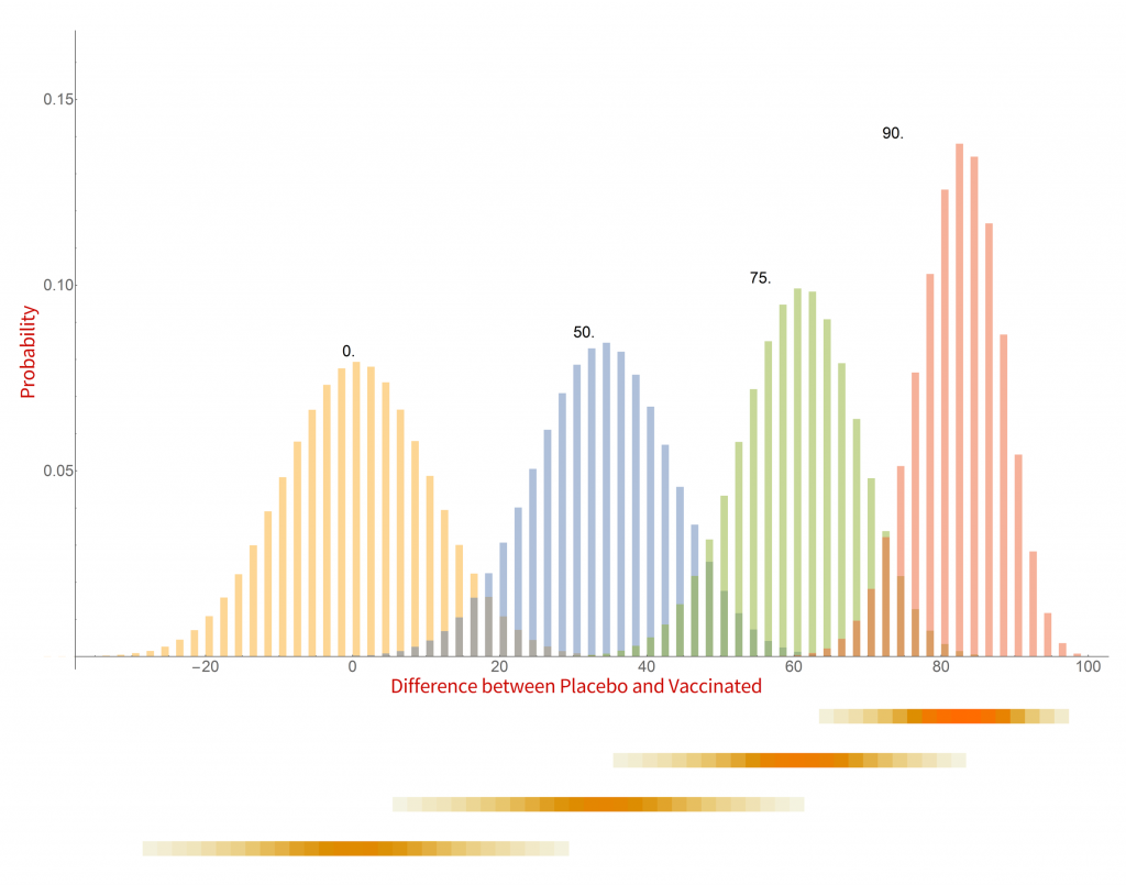
Histograms of the probability of a clinical trial of a vaccine with an assumed efficacy resulting in a particular difference in COVID-19 case numbers between the placebo and vaccinated groups. CC-BY-NC Dale E. Tronrud / Coronavirus Structural Task Force
There are a whole lot of interesting things in this graph. When the vaccine is completely ineffective the most common result of a trial is a difference of zero between the Placebo and Vaccinated groups. There is a fairly wide distribution of results that occur, however. This is the result of statistical fluctuations due to the small number of cases of COVID-19 in the sample (here 100). The distributions for all the simulated efficacies have about the same width, with the exception of those near 100%. Since the difference can never be larger than 100 those distributions get sharper and develop a tail on the lower side.
Let’s look at some scenarios. The graph shows that the most common result of a trial of a vaccine with efficacy of 50% has a difference in number of cases between the Placebo and Vaccinated groups of 36, but sometimes the difference is larger and sometimes smaller. If the vaccine was worthless the most common trial result is zero, but there is also variability. The two histograms overlap considerably which indicates that one cannot distinguish between an efficacy of zero or 50% if the difference in the number of cases in your trial is in the range of zero to about 36. If the difference is greater than this you could conclude that the vaccine is more likely to be 50% than zero percent, and zero percent is the more likely of the two if the difference is negative. Still, there is a wide range of possible outcomes of a trial that have ambiguous interpretation.
On the other hand, what if we have a difference of 80 (90 cases in the Placebo group and 10 in the Vaccinated group)? There isn’t any significant overlap between zero percent efficacy and 90% at the point where the difference is 80. It is much more likely that the vaccine is 90% effective than zero. There is overlap with the 75% effectiveness histogram and we have to admit that it is possible that the vaccine is only 75% effective, but 90% is more likely.
This leads us to realize that the result of a vaccine trial has to result in a range of possible efficacies, with a varying probability of each. My little plot doesn’t make such an assessment very easy. In fact, the plot is starting to show some problems. What it shows is the probability of a trial having a particular result given the effectiveness of the vaccine. What we really want is the probability of each possible efficacy given the result of the clinical trial.
We have to transform our probabilities!
Turning everything on its head
While the calculations I just discussed were easy to set up and understand, they do not really reflect the experiment being done in a vaccine trial. I was assuming an effectiveness of the vaccine and running many, many trials. In reality the effectiveness is unknown and only one trial is run. Where I calculated the probability of a particular difference in COVID-19 cases given the effectiveness of the vaccine what I really want is the probability of the effectiveness of the vaccine given the results of a single clinical trial. It is often difficult to devise such a calculation from scratch but it is pretty straight forward to calculate it from the results I already have.
The first step toward the proper calculation is to expand the current plot. My first figure included simulations of just four possible efficacies. To display more possibilities, I need to abandon histograms. At the bottom of the plot I show four color-shaded bars. In these bars the color is darker when the corresponding histogram is taller. While not as visually clear these bars have the advantage that they can be stacked, and many more plotted in a single figure.
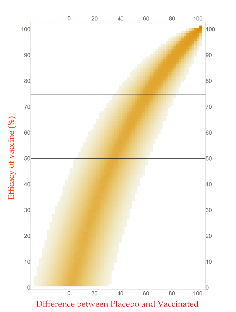
With this new tool I can calculate and display the simulated distribution of clinical trials for every vaccine efficacy from 0% to 100% in 1% steps. The new chart is displayed here.

CC-BY-NC Dale E. Tronrud / Coronavirus Structural Task Force
This chart is read by locating the efficacy of your vaccine on the vertical axis and drawing a horizontal line there. The pattern of colors along that line represents the probability of each difference in cases between the Placebo and Vaccinated groups in a clinical trial. I have drawn two such lines, one for a vaccine with 75% effectiveness and another for one with 50%. You can see that the most likely result for the 75% one is about 60 cases (20 in Vaccinated and 80 in Placebo) and the other at about 34 cases. (You figure it out.) In this plot you can see the continuous change as the efficacy of the vaccine is changed. The key point is that there is a spread of results, but I described that before.
With any set of probabilities the full set has to always add up to one. For each horizontal line of colored boxes in this plot the sum of their probabilities is one. A set of numbers with this property is said to be “normalized”.
The vertical lines are not normalized in this plot, as you can see by looking at its left side. There are just a few, very lightly colored or low probability boxes and above them is simply white, which represents zero probability (or at least very, very, very small). This side of the plot has a difference in COVID-19 cases of -24, or in other words the Vaccinated group had 24 more cases of disease than the Placebo. Such an outcome for a clinical trial is very unlikely for any vaccine that has even a tiny amount of success (and is pretty unlikely for one that is merely useless).
Since the probabilities along vertical lines are not normalized they cannot be used as a histogram. Conveniently for us, this can be corrected simply by normalizing them. This is done by summing all the probabilities along each vertical line in this plot and dividing the probabilities in the line by that sum. This gives us a new set of probabilities and a new plot.
How does this magic work? The procedure is justified by a hundreds-of-years-old mathematical theorem called Bayes’s Law. This blog post is already getting long and I leave the application of your favorite search engine to you.

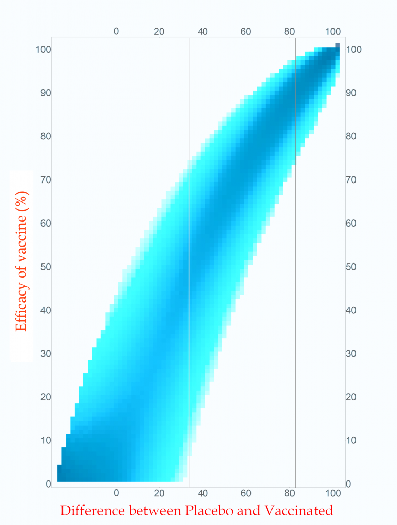
Probability of vaccine effectiveness as a function of clinical trial outcome.
CC-BY-NC Dale E. Tronrud / Coronavirus Structural Task Force
The first thing to note is that the new plot isn’t much different than the original. While the lower-left side has clearly changed, that area is not very interesting. On the right, where the action is, it looks the same. For this reason, many fields of science simply use the unnormalized plot.
The new plot allows us to draw vertical lines (but forbids horizontal lines!). I have drawn example lines at differences of 36 cases and 82 cases. If our clinical trial results in a difference in cases of 82 (91 in Placebo and 9 in Vaccinated) we can see from the line on the plot that the most probable effectiveness of that vaccine is about 90%! This is very close to the happy number reported in Pfizer’s press release. The plot also shows us that there is uncertainty in this number. The vaccine’s effectiveness could be in the mid 70’s or in the upper 90’s.
This is the nature of all experimental work. All results have uncertainties and it is as important to know the amount of uncertainty as it is to know the direct result. You can see how important this is by looking at the 36 case difference line. The darkest blocks along this line, and therefore the most probable efficacy, are near 50%. This would also indicate a useful vaccine, but look at the spread! The width of the uncertainty goes all the way to zero – This vaccine could be worthless. A clinical trial that waited until only 100 cases occurred cannot distinguish between a vaccine with 50% efficacy and a worthless one.
If you wait for more cases to develop the width of the stripe in the plot becomes narrower and the uncertainty drops. The goal of Pfizer was to develop a vaccine of at least 50% efficacy so their design was to wait for 164 cases to give them a narrow enough band to clearly distinguish 50% from zero percent. Just in case the vaccine was better than 50% they built into the design of their trial several points where they could peek and see what was going on. They, and we, lucked out!
What are all those other people for?
The surprising thing about this analysis is that the total number of people in the trial is unimportant when calculating the uncertainty of the result. That answer is the same for a trial with 500 volunteers and a trial with 50,000 volunteers. The only thing that is important is the number of cases of COVID-19.
All those tens of thousands of people are important for other reasons. Very relevant to the current pandemic is that a larger number of volunteers will accumulate the target number of cases sooner: if you double the number of volunteers you will reach the target in half the time. We all want to know as quickly as possible if these vaccines are effective so we want the trials to consist of as many people as the companies can manage.
The other use for large numbers is the search for grim and hopefully rare side effects. These are likely to arise at much lower rates than viral infections and much larger numbers of volunteers are required to achieve statistical significance. A side effect that only occurs in 1 of 5,000 people will require a very large number of participants to be detected. A compounding factor is that a search for an unknown result requires many more data points than the search for a specific outcome, such as COVID-19 infection. (The checks for side effects are only now being described to the public, and I’ll not go into them here.) While the doctors keep an eye out for life threatening problems during the trial, the secret books identifying which volunteers are in which group are kept closed until the end.
End game
After all this interesting math I find that, yes, 94 diseased people are quite enough to conclude that a vaccine is effective at around a 90% level, or at least 70%.
Postscript
During the writing of this post Moderna issued a press release about their vaccine candidate. The analysis presented here applies equally to their trial since I made no assumptions at all about the nature of the vaccine being tested. The only complaint I have with their press release is that they quoted the effectiveness of their vaccine as 94.5%. As you now know, this level of precision is ridiculous. It would be better just to say it is “somewhere around 95% effective”.

Thanks for the diligence and making your font easily readable! At least until we got to the "Leave a Reply" section.