Form follows function
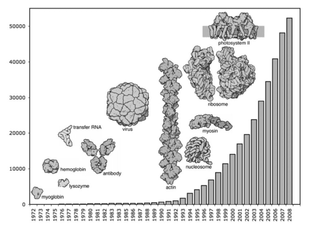
Proteins are big molecules, ranging from 400 to 20 000 atoms. They are the work horses of the living world – they break down what you eat, build your muscles, organise cell division, make up hair and skin. They are formed from amino acids as a long chain that then cross-links and folds into the functional molecule. The sequence of the amino acids – there are 20 different ones – determines the fold, but in many cases, we cannot predict it: it is too complicated (yet), so that we have to determine the molecule’s shape experimentally.

If we learn the structure of a protein, we can understand how it works and what it does. The corona virus encodes its own proteins which are made by human cells when infected. These proteins interact with human proteins, and hence, understanding them is crucial: disabling the viral proteins, or disrupting their interactions with the human host can stop the infection, and permit us to fight the virus and gain the upper hand.
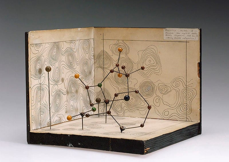
But how do you even measure and visualize something so small? Good question! After the difficult task of making a crystal from such large (and somewhat floppy) molecules and shooting it with X-rays like a madman, the data get interpreted with a model of the structure.

But even if you have a model, it is really difficult to see anything. There are too many atoms. The increase in the size of molecular structures we can determine experimentally, and their growing number necessitated a better way to visualize them. A big step to solve that problem was taken by Jane Richardson of Duke University, when she created the Ribbon Diagram in 1980.
The Ribbon Diagram
"I don't see how you could possibly describe a protein structure in a thousand words, but you can come a lot closer with one picture."
- Jane Richardson
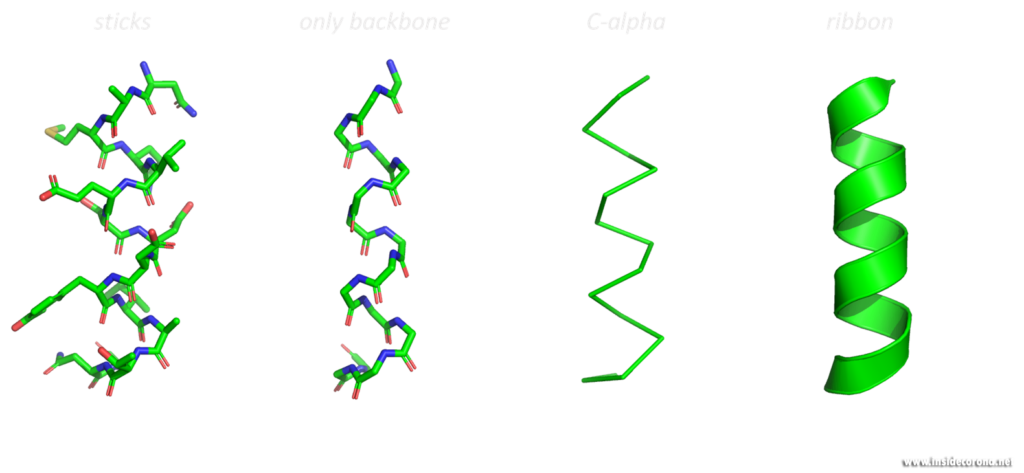
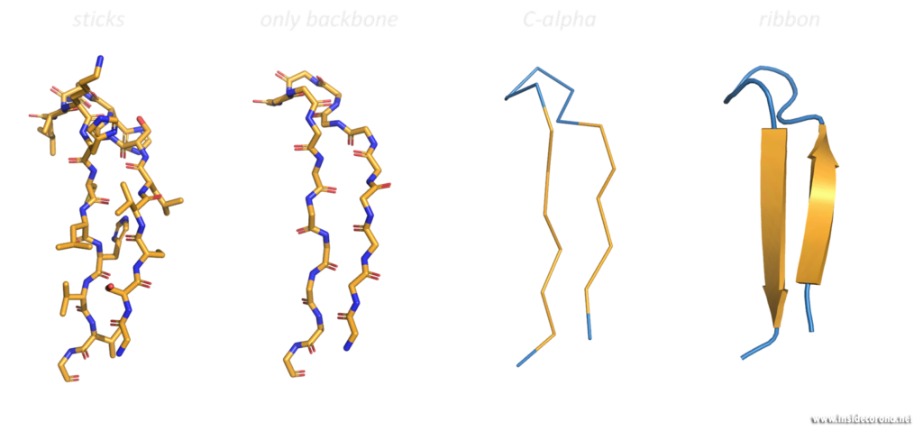
These three-dimensional, schematic representations are the most common visualization of protein structures. The ribbon shows the backbone (= amino acid chain) of the protein. Depending on the basic fold, determined by so-called hydrogen bonds, the peptide chain can be separated into one of three categories, so called secondary structures: α-helices, β-sheets and loops. These are then shown as ribbon helices, arrows (to indicate parallel β-sheets, in which all amino acid chains go in the same direction, or anti-parallel β-sheets, in which they have alternating directions). Loops are shown as a tube with a smaller diameter than α-helices or β-sheets. Any additional features can then be added, as well as labelling.


Looking at macromolecular structures with visualizations like the ribbon diagram can provide a good overall view of the protein’s inner conformation, its symmetry and possible interaction and binding sites. Different structural features promote different functions in proteins. A uniform presentation of gathered data is the key to better understanding and comparing these small machines, which work in and around us at every second.

Regarding the current problem child – the SARS-Coronavirus-2 (or hCoV2019), ribbon diagrams of viral proteins reveal numerous insights into the structure and function of different parts of the virus and its infection of host cells. While making the atomic model to begin with is a difficult task in its own right, the contributions of Jane Richardson and others form how we, and every new generation of molecular biologists, perceives and thinks of macromolecules and the molecular basis of life.
Got interested? Read more about this at:
https://iubmb.onlinelibrary.wiley.com/doi/full/10.1002/bmb.2002.494030010005
https://research.duke.edu/ribbon-diagrams
https://blogs.sciencemag.org/pipeline/archives/2018/11/05/hail-to-the-ribbon
