The coronavirus cannot be seen with the naked eye; it is invisible. That is a huge problem. Imagine if your house were on fire: you would react immediately, leave the house, call the fire brigade and warn the neighbours. The thread would be clearly visible. This is, however, not true for the coronavirus. SARS-CoV-2 cannot be seen or touched. The time between infection and tangible illness is a number of days, with an additional 16 days until the worst-case scenario, death (2). This makes the threat much harder to recognize. Imagine a catastrophe killing 32.362 people in New York City! Still, the same number of deaths occured in recent month in NY – 1 in 250 persons – by COVID-19 (3). The invisibility of the threat makes it hard for people to wear masks and keep distance to each other. It is very difficult to adress a danger you can’t see, and even harder to believe in something you don’t understand.
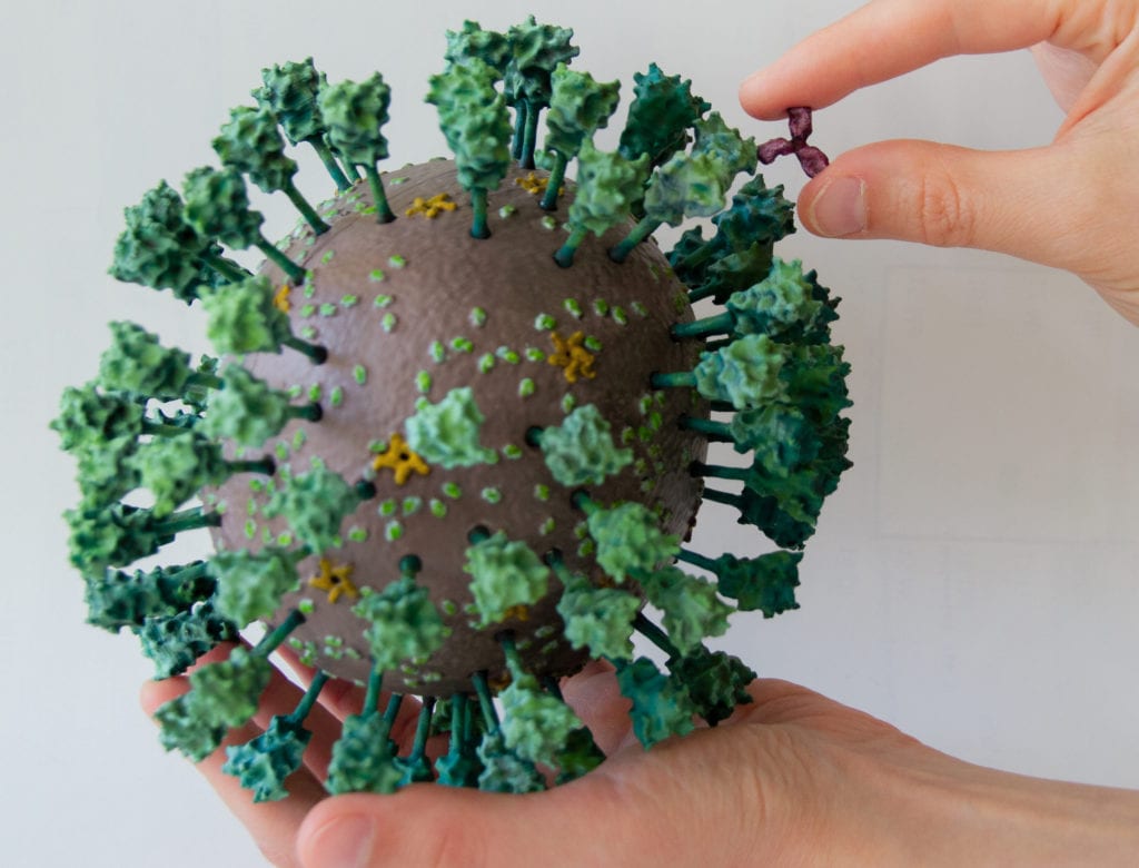
This is why we want people to see the virus, or even better, to touch it. Make it tangible. And this is why we have designed a scientifically accurate model for 3D print. And the best part: As we are funded by taxpayer money, we have made the files available online for free! (If you use them, please acknowledge the Coronavirus Structural Task Force.)

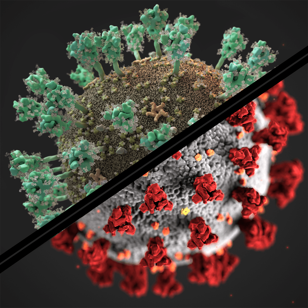
Now that is a bit different from what you have seen in the media, isn’t it? Why? Well, first of all, any kind of spikey ball passes as a corona virus these days. Our virus also differs from the illustration by medical illustrators Alissa Eckert and Dan Higgins from the CDC (4). These are the main differences between their red-and-grey depiction and ours:
- The virus is not exactly spherical, and rather wobbly; which can be seen clearly in our 3D print.
- The number of Envelope proteins (orange), membrane proteins (yellow) and spikes (green) are in accordance to the latest findings (2).
- The spikes are longer, as we now know much more about their structure, and the virus hull is smaller in proportion to them. However, the exact size of the virus varies. The ratio we show is an average.
- The spikes are glycosylated, making them more irregular (and slimier). The glycosylation is shown in grey. However, it would actually look like this, and could be represented by cotton wool stuck to the spike protein.
- We are showing the E protein in the pentameric “pore” conformation. Whether that is a correct assumption for the virion remains to be seen. If you want to know more about this, look here.
- As the virus lives embedded in slimy, wet conditions, we chose colours to represent that instead of the red and grey which the CDC used to represent the threat the virus poses (1)

We have also added a rhinovirus and an antibody in the same 1 : 1,000,000 scale. The antibody binds to the spike specifically, this is how the immune system can recognize the virus – and the rhinovirus shows you how large SARS-CoV-2 is. (Spoilers, it is very big for a virus!)
One should also say that the "virus" is actually a virion - the transport form of a virus, which can be spread - once a host cell is infected, the virus rolls out his RNA genome and makes a whole lot more proteins to hijack the host cell and make more copies of itself. These proteins are also part of the virus, and a main subject of our research.
References:
(1) Rothan Hussin A., and Byrareddy Siddappa N. "The epidemiology and pathogenesis of coronavirus disease (COVID-19) outbreak." Journal of autoimmunity (2020): 102433. pmid:32113704
(2) https://wwwnc.cdc.gov/eid/article/26/7/20-0282_article
(3) 32.362 deaths by 17th of July 2020 as reported by the New York Times in 8.4 million inhabitants (US Census Bureau) gives 0,39 %, roughly equalling 1 in 250.
(4) https://www.nytimes.com/2020/04/01/health/coronavirus-illustration-cdc.html

Isn't the scale in fact 1 000 000:1?